
A Deep Dive Into Contrast Ratios
It may be time for some hard decisions. You’ve got your site up and running and it’s all working well! You’ve learned there are some things that you mostly can’t even see that used to make your site inaccessible to various people, but as you’ve followed this accessibility series, you’ve jumped in there and fixed a lot of things to make your site more welcoming to all, and it still looks great! But now it might be time to start taking a hard look at your site to see whether some of your color choices are making it more difficult for people to get what they need from your site. This question all comes down to contrast ratios. As you’ll learn in this post, if the contrast ratios of the various elements of your site are high enough, it’ll make it easy for all your visitors, and especially those who suffer from low vision or colorblindness, to have the experience on your site that you want them to have. If contrast ratios are too low, though, it could be a significant barrier for some people. Let’s take a look at some potential problems, and how to fix them.
Lessons from the Bullring

You may have heard that bulls can’t actually see the color red, so when they charge the matador’s cape, it’s because of the movement rather than the color. It’s a good thing, then, that the matador compensates for his poor choice in color with plenty of movement to rile the bull up. The matador knows his audience (the bull) well enough to get his message across even though the bull just sees his cape as kind of a dull grey thing.
You’re not trying to dispatch your audience in such a brutal and controversial way as the matador is trying to dispatch his bull, but you do want to catch your audience’s attention, and fully one in twelve men are color blind and so are half a percent of all women are (that’s nineteen and a half million women), so accessibility for all of them makes it important that you consider the contrast ratios of the various colors in your site.
What’s This All About?
Color contrast ratio is the difference in luminance of two adjacent colors. In most cases the adjacent colors we’re interested in here are the colors of the foreground (usually text of some sort) and the background. The contrast we’re looking for is in the difference in luminance of those two colors. Though it has some other factors too, for simplicity’s sake you can think of luminance in terms of brightness.
If you’ve got a bright color for the text on a dark background, it’s quite easy to read that text. Ditto for the dark color text on a bright background, like the standard black text on a white sheet of paper. The difficulty comes when the brightness of both is close to the same. In that case, it can be very difficult to read, particularly for some people with vision difficulties. This is the case for low-vision folks, color-blind folks, and the elderly. Because contrast problems affect these groups more dramatically, it may not affect you, so you may not be able to just look at something and tell whether the contrast ratio is troublesome or not.
What's the distinction?
Some things may be obvious. For example, even you, with your perfect vision, may find it difficult to read yellow text on a white background like the text in this box.
Often sites will have buttons with a background color not much darker than that yellow text, but a button text of white, which results in the same contrast ratio.
Other times people with no visual challenges may not realize the magnitude of the effect their color choices have on those who do. For example, this box has a red background and blue text that is a little difficult to read for most, but might fit the brand.
Unfortunately, the text in this box has a contrast ratio of 1.01:1, which is even worse than the yellow-text example above.
What Are the Standards?
The World Wide Web Consortium has released the Web Content Accessibility Guidelines (WCAG 2.1), which states that all regular-sized text should have a minimum contrast ratio of at least 4.5:1 with its background. Large text should have a minimum ratio of 3:1. For reference, black text on white background has a contrast ratio of 21:1, and the text of this blog post has a contrast ratio of 4.6:1.
There are a few different ways to check the contrast ratios of the various parts of your webpage, but the most reliable is to find the hex value of both the foreground and background colors and take that to one of the various contrast-checker websites available (my favorite is https://webaim.org/resources/contrastchecker/).
Fill in the codes for foreground and background, and it’ll tell you what the contrast ratio is. If you use the WebAim one, it will also tell you whether it would pass compliance according to WCAG 2.1 level AA (basic compliance) or AAA (more stringent), for regular or large text. WebAim also has a luminance slider under each color that you can adjust to get a color pair that is compliant.
Edge Cases: Image Overlays
The above technique works very well for simple combinations like text and its background, but for more complex things, like a heading you’ve got positioned over a hero image, you’ll need another tool, this one a browser. If you haven’t got it already, download Firefox and point it to the page you’re curious about.
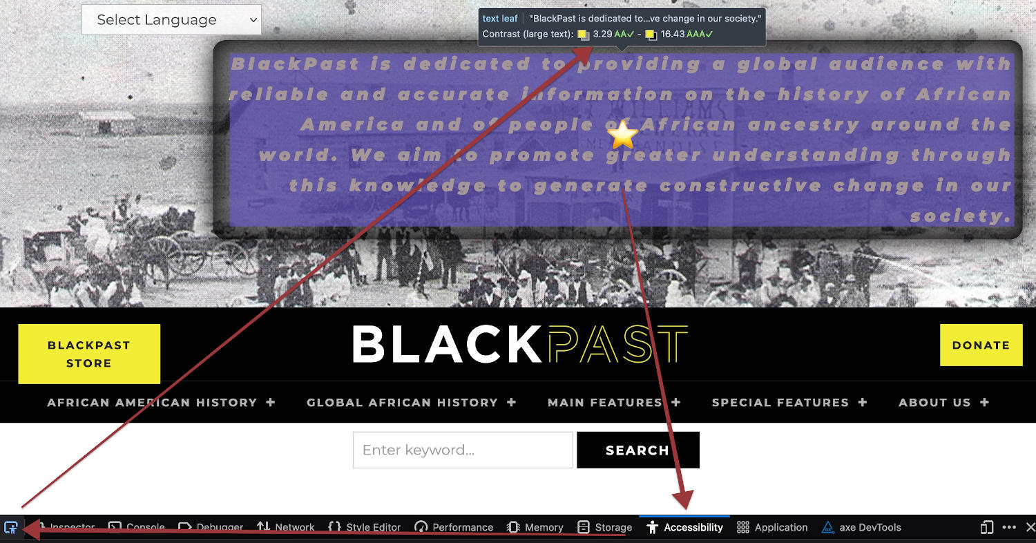
Once there, right-click on the text that’s over an image. From the options that pop up, select “View Accessibility Properties”. The Firefox Dev tools should open up in a frame below the web page, or off to one side, with Accessibility selected. Click on the Accessibility Inspector icon [![]() ] on the far left of the frame, and then hover your mouse over the text you were curious about. Firefox will measure the contrast ratios of the text against every part of the image it’s over to give you a range of contrast ratios of that text to the image.
] on the far left of the frame, and then hover your mouse over the text you were curious about. Firefox will measure the contrast ratios of the text against every part of the image it’s over to give you a range of contrast ratios of that text to the image.
In the following example image, you’ll notice that on my favorite black history site, BlackPast.org, the hero text set over this particular image has contrast ratios of between 3.29:1 (which, since it is large text, is AA compliant) and 16.46:1. You can use this same accessibility inspector in Firefox to hover over the various other elements in the page and see other less complex color contrast ratios, as well.
As far as how to fix any problems you find through the Firefox accessibility inspector, or even directly through the WebAIM contrast checker, for simple errors I’ve already explained how to use the sliders in the WebAIM contrast checker to adjust your colors. For contrast errors in text that sits over images, it’s a little trickier. You’ve got basically three choices for that. The first is to darken the whole image if it has light text sitting over it, or lighten it if it’s got dark text over it.
If BlackPast had done that, here’s what their hero text would have looked like, with the same acceptable contrast ratio as noted above:

Another way to fix a problematic contrast ratio over images is to give the letters of the text itself outlines, with the CSS text-shadow property. I favor a simple 1px outline that can be achieved by using the property in this box.
This may technically comply with the WCAG standards (see what the W3C has to say about how this technique can work for a similar, or perhaps analogous, situation here), though it may not make text as easy to read for all individuals as either of the other two methods, as you can see in the image below.

The text in this last option is legible, but it’s not as easy on the eyes as the other two options, so I believe BlackPast has chosen the best option by putting a semitransparent dark background on the text itself, and jazzing it up with a border radius and some fading:

As an interesting note, here’s what their banner would look like without any remediation:

This is practically as unreadable as my initial illustration of yellow text over a white background, because in large parts of the image, that’s more or less what it is.
Other Temptations: Links
Another place where I see people tending to go wrong is with their links. Most companies have one or two brand colors that they want to give prominence to, and the way they sometimes try to do that is by assigning that color to their links. This makes a lot of sense, but unfortunately it’s not usually a great idea.
Often the primary brand color has a low contrast ratio with the background color, which might make the links essentially invisible to a low-vision individual (think of the yellow text above). Thus a design choice intending to draw special attention to the links often has the exact opposite effect. If you’re in this boat, and want to use your brand color to show off your links, please reconsider. If you have an alternate brand color that’s darker, maybe use that one. Or use a darkened version of your brand color for links, using the WebAIM contrast checker to figure out how much it needs to be darkened.
Furthermore, from the days of WCAG 2.0 (which still applies, though WCAG 2.1 builds on it), the standard has been that color alone should not be the only thing used to indicate links, unless the difference in luminance between regular text and link text is greater than 3:1. Even the standard pure blue that is the default color for links in most browsers narrowly fails to meet this standard, as its contrast with black is 2.23:1. This may be why the other default link style is to have it underlined so even colorblind individuals can distinguish links.
If your theme, or stylesheet reset, has disabled this underline, I encourage you to put it back in. Or you could replace it with something else that’s not dependent upon color to indicate links. You could, for example, make links bold, or uppercase, boxed or outlined, or have a link symbol after them(🔗). All of these things can easily set the links apart from the regular text for people with both acute vision as well as low.
In any event, no matter the color problems you may be facing in your site, there are various ways you can fix them to ensure that your site is as welcoming to everyone as it should be. You can’t start the process of fixing any color problems with your site until you discover what they are, though, so please jump into Firefox and start inspecting your site for color choices that you might need to reevaluate.
Are you seeing red when you look at your site? Contact us for a consultation and we'll help you figure out what to do about it.
Read More in Our Accessibility Series

Swimming with the Fish: Accessibility Statements
You’ve worked to ensure your site is as accessible as possible; the next step is to add an accessibility statement to tell what you've done. Learn…
0 Comments6 Minutes

Sharks in the Water 3: Now See Here!
You’re looking a shark (lawyer) in the eye, trying to stare it down, but you’re struck by the irony that seeing is the whole problem in the first…
0 Comments9 Minutes

Keeping the Sharks at Bay Part 2: Don’t move!
The sharks are circling you, but the letter they sent you didn’t mention anything about auditory challenges, so our last installment of the series…
0 Comments8 Minutes

Keeping Sharks at Bay Part 1: Your Site’s for Everyone, You Hear?
By the end of this three-step process, you’ll have addressed the various issues you face. It’s impossible to instantaneously fix everything about…
0 Comments6 Minutes