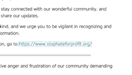
Starting Small: Color Contrasts
Argosy wanted us to make sure their colors were easy for everyone to read, even for those with colorblindness or loss of contrast sensitivity. There were half a dozen colors throughout the site we had to change, but their standard link color is illustrative of the rest. Notice in the image simulating loss of contrast sensitivity how much less difficult it is to read the link.
WCAG 2.1 Success Criterion 1.4.3 Contrast (Minimum) (Level AA)
The visual presentation of text and images of text has a contrast ratio of at least 4.5:1…
Before
Original link contrast ratio = 1.75:1.

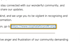
After
New contrast ratio = 4.62:1

Moving On: Focus Indicator
Originally, Argosy’s site left the style of the focus indicator (showing keyboard users which element they’ve selected) up to the individual browsers. These are inconsistent, and some of them (notably Firefox’s at the time, seen below) aren’t very apparent. To give a consistent and attention-drawing indicator to those who need it, we designed a flashy, brand-consistent focus indicator only visible to the keyboard users who use it.
2.4.7 Focus Visible (Level A)
Any keyboard operable user interface has a mode of operation where the keyboard focus indicator is visible.
Before: Indistinct Focus
Firefox default was a thin dotted line, pretty hard to see
After: Obvious Focus
New style is bright, flashy, and bold for those who use it
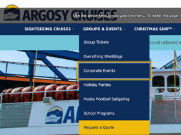
Next Up: An Accessible Menu
Argosy’s keyboard users were initially unable to access any of the menu items in the dropdown since it would only drop down when mouse users hovered over it. We fixed this oversight in the styles and went even further to make it usable to keyboard visitors by writing and installing the Crow’s Nest plugin which enables navigation of the menu with the keyboard arrow keys. This made it so that a keyboard user could get to even the last menu item with a mere seven keypresses rather than forty-two, as originally.
Success Criterion 2.4.5 Multiple Ways (Level AA)
More than one way is available to locate a Web page within a set of Web pages except where the Web Page is the result of, or a step in, a process.
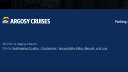
Communicating Accessibility
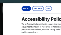
Argosy initially had no accessibility statement to show their commitment to visitors with disabilities. They used an online generator to make one when we first started working with them and we put a link to its page into the footer menu structure, but it always felt like an afterthought. We helped them revise the statement to be more personal, and included it in its own lightbox available on every page of the site.This lightbox includes a log of the accessibility work we’ve done, as well as a convenient way to contact them with accessibility concerns, all of which shows a deeper commitment to accessibility.
Guidance from W3C
Accessibility statements are important for several reasons, [among which, to] show your users that you care about accessibility and about them.
Before: Impersonal Afterthought
Standard page with little commitment indicated
After: Deliberate Connection Point
Added functionality, experience, and commitment