For Starters: Enabling Zoom
Originally, when users with poor vision would come to the site on their mobile devices and try to zoom in to make the text big enough to be able to read it, they’d find themselves unable to do that. This is because the site had some code that specifically disabled this ability. For accessibility, the general standard is that all sites should allow zooming on mobile to at least 200% of its original size.
We reworked the code that was disabling the zoom ability so that it was enabled to 500% of its original size. Probably not many people will zoom it to that extent, but we believe it’s best to let people make their own decisions in such cases.
1.4.4 Resize Text (Level AA)
Except for captions and images of text, text can be resized without assistive technology up to 200 percent without loss of content or functionality.
Before: No mobile zooming
Mobile visitors limited to initial text size on phones
After: Zoom up to 500%
Visitors who need it can zoom in greatly
Next Up: Color Contrast
South Sound has several instances of photos with text overlaid on top of it. Often, doing this will result in the text being extremely difficult or even impossible to read for visitors who suffer from contrast sensitivity loss. This can be remediated by darkening the image if the text over it is light, or lightening it if the text over it is dark, but some of the images in question had both light and dark spots that would have made it extremely difficult to find a happy medium on.
Instead we recommended, and South Sound agreed to, the less conventional approach of giving the white text on top of the images a black outline. With this approach, the text contrasts with its own outline rather than the underlying image, resulting in text that is much easier to read for everyone, especially those with contrast sensitivity issues.
Success Criterion 1.4.3 Contrast (Minimum) (Level AA)
The visual presentation of text and images of text has a contrast ratio of at least 4.5:1


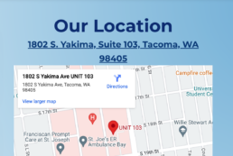
Also: Map Accessibility
The map on the site, designed to add the ability for visitors to more easily navigate to the clinic, was inaccessible to assistive technologies. Since this erroneous coding came directly from Google Maps, there was nothing we could do about it. To provide the same functionality, however, we made the address of the site into a link to the location on Google Maps’ own site, which is accessible.
4.1.2 Name, Role, Value (Level A)
For all user interface components the name and role can be programma-tically determined… and notification of changes to these items is available to user agents, including assistive technologies.
Before: Faulty Google Map Embed
Users of assistive technology unable to benefit from the map
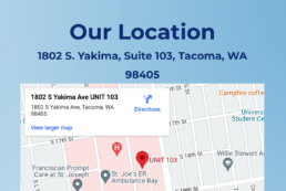
After: Link to Accessible Map
Map functionality enabled through link on the address