Multimedia is a great way to increase the engagement in your site, but don't forget to take the steps to make it as accessible as possible.
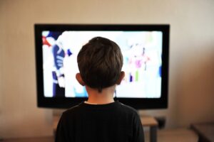
Probably since the first time a caveman made a shadow puppet on the wall for a riveted audience, people have been intrigued by moving pictures and multimedia. Despite the widespread prevalence of video and sound on demand today, people haven't lost their fascination with such media, and if anything, media seems to have secured its hold that much more tightly on everyone because of its ubiquity. Stick a kid in a room with a blaring television, and good luck trying to have a conversation with him or her! Heck, stick an adult in the same space and you'll likely have the same problem...
Probably because of this captivating hold on people, there are many blog posts and articles about the value of using videos and other multimedia to drive engagement in your website. One of my favorites was published by Hubspot just last month, called “The Art of Engagement: Elevating Web Design with Multimedia Magic” by Danielle Richardson Ellis.
For a pretty good basic treatment of why you should add multimedia to your site and what sorts of things you might consider adding, I suggest you read that. After you get past the somewhat awkward introduction (I’ve certainly written plenty of those, so can’t criticize), you’ll get to some very good information. There’s something missing from Danielle’s analysis of the situation, though, and it’s something we here at SeaMonster Studios think should never be overlooked: accessibility considerations.
When multimedia doesn't add engagement
The point of most industry posts on multimedia is generally that it adds engagement. To that we’d append the caveat that it only adds engagement if users can perceive it. The point can be made that multimedia helps visitors understand your point more fully, but we’d add that that’s only if they can operate it.
Likewise, multimedia may be more impactful and persuasive to your visitors than just text, but only if they can understand it. And finally, some might say that multimedia helps people understand your ideas because it’s how they prefer to learn: it’s what they’re used to and comfortable with in today’s society. We’d agree, but point out that it can only help them understand your ideas if it’s robust enough to be translatable by their preferred assistive devices.
Perceivable, Operable, Understandable, and Robust (POUR) are the four guiding principles of the Web Content Accessibility Guidelines (WCAG). The WCAG are the guidelines websites are required to follow to make them accessible and keep them out of legal jeopardy for discrimination. Ensuring these four principles (the POUR principles) is the reason the WCAG has certain standards for the use of video and multimedia. If those standards are followed, it will ensure that users of assistive technologies, and others with disabilities, can get an equivalent experience with the media that you provide.
Principles of the Web Content Accessibility Guidelines
So when doesn't multimedia increase engagment? When it's poured out on people who can't perceive, operate, or understand it robustly.
Video concerns
There are basically three requirements you need to meet to be able to use videos accessibly.
Captions
 The first, hard requirement when using videos, is that you provide accurate captions. This is required so that people who can’t hear the audio can still have an equivalent experience with your media. As an accessibility concern, this is designed for those who are deaf or hard of hearing, giving them a way to get the same information from the video that others can.
Transcripts
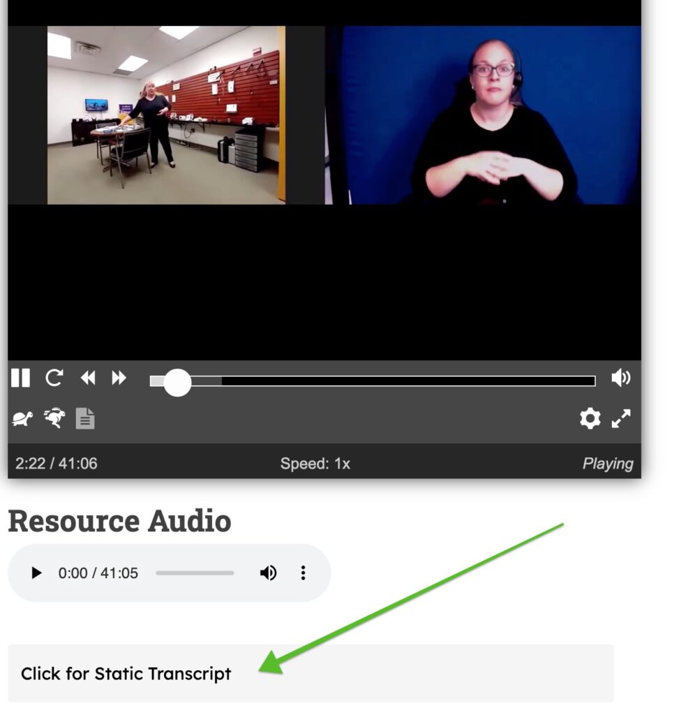
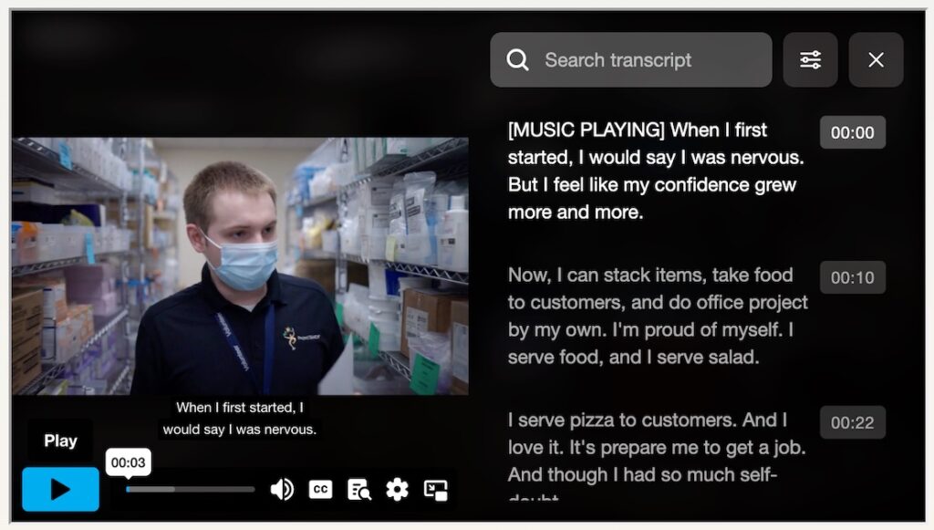
![]() The second requirement is that you provide a transcript for the video or audio file you’re including. This makes it possible for blind people to get an equivalent experience by having their screen reader software read the transcript out to them. I’ve heard from some blind people that this is their preferred method of consuming videos since their screen readers can read transcripts off much more quickly than the whole video can be presented.
The second requirement is that you provide a transcript for the video or audio file you’re including. This makes it possible for blind people to get an equivalent experience by having their screen reader software read the transcript out to them. I’ve heard from some blind people that this is their preferred method of consuming videos since their screen readers can read transcripts off much more quickly than the whole video can be presented.
Audio Description
 The third requirement is that you provide an audio description that includes key visual information from your video in breaks in its audio so blind visitors can have a comparable experience to sighted ones. Creating an entirely separate video that includes audio descriptions may be a tremendously involved undertaking that may not be necessary if audio cues to what’s happening are already present (ie. “As we walk into this factory, you can see that…”).
If there are substantial visual elements that are never described in the current audio, the best solution is to engage with an outside company to rework the video. Alternatively, if you’re only interested in meeting a lower standard on this (WCAG level A rather than level AA), you can include descriptions of the visual elements in your transcript of the video, making it a descriptive transcript.
Broader benefits
It’s important to note that though these requirements are aimed at giving access to people with disabilities, by following the captioning requirements, you’re also helping other parts of your audience as well. For example, visitors to your site may be accessing it on their phones in a noisy environment where they wouldn’t be able to hear your audio. Or they might be accessing it in a library or another environment that would require them to silence the video.
In some ways, adding transcripts is even more helpful to a broader range of people. Many people might prefer to skim the transcript instead of watching the video, or use the transcript to figure out what part of the video they should watch. Further, since transcripts can be a searchable part of the page, that also means they can be indexed by search engines, leading to greater SEO benefits for your page.
How to add captions and transcripts
The easiest way to add videos with captions to your page is to use YouTube, either with a video that you uploaded yourself, or one of the other ones on its site. By doing this, you won’t have to worry about copyright violations since YouTube’s goal is to have their videos displayed everywhere. You won’t have to worry about doing the captioning yourself, since YouTube automatically captions all videos by default, though their captions do leave something to be desired, as illustrated in this funny video:
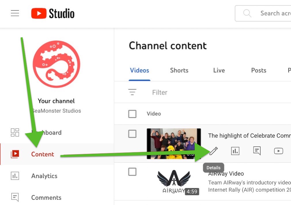
It is a very good idea, if the video is your own, to take a few minutes to review the caption text for errors. Being familiar with the video, you’ll find any errors quickly, and fixing them will greatly improve the experience of anyone using them. Review the auto captions by going to YouTube Studio in your browser, hovering over your video file, and clicking the Details (pencil) icon. Here you can watch your video, see the captions YouTube has generated for it, and edit them for accuracy. If your video language never got set, you may need to do that before YouTube can automatically caption your video, but once it does, you can and should take some time to edit it.
Next, you should generate a transcript to include on the page where you put the video. The easiest way I’ve found to generate a YouTube transcript is to go to KomeAI’s YouTube Transcript Generator, and let it generate the transcript from the video’s subtitles.
The transcript will be broken up into the same lines that the captions were, and will have the same punctuation (ie. usually none), so you should spend some time reworking it into a more pleasing form. Even if you don’t take the time to do that, though, it’ll serve its purpose better than if you leave the transcript off entirely.
I recommend you put the transcript in an expandable accordion (like an html details tag, for example, or whatever accordion your site has available) below the video. That way the people who want it can expand it, but it doesn’t clutter the page up too much for people who don’t.
For subtitles and transcripts for non-YouTube videos, and audio, and maybe even for YouTube as well, though using it there requires the extra step of uploading it for the video, I recommend Revoldiv. This service lets you transcribe video and audio files for free, edit the really quite proficient transcriptions easily, and export them as caption files you can upload to YouTube or other services to be used instead of their auto captioning.
For self-hosted videos, you can set the captions in connection with your video player (I recommend Able Player as it has an accessible interface and support for captions, languages, audio descriptions, and even live transcript).
Other media types
Video is probably the easiest and most impactful media type to add, though it’s by no means the only option.
Audio
 Audio clips can bring a little extra sparkle to your site, or even be used to add a sort of soundtrack to your page. One caution along those lines, though, is that you shouldn’t force anything like this on your visitors. You may have the perfect song you’d love to accompany your page, but though autoplaying audio is possible under some circumstances, I’d recommend you not do it.
In most circumstances, the browser will block autoplaying audio by default so your users will never benefit from it. In the rare times when your audio gets around the browser’s prevention, many of your users may do what I almost always do when some site begins playing audio I haven’t asked for. I mute the whole browser window to get rid of that unwanted audio. I bet many of your visitors have the same strategy.
But it really is the perfect song, you say. If you can’t autoplay it, how do you give your visitors the chance to have the perfect experience? You do it by adding a notice with a small video or audio player in it asking visitors to push the play button to experience your site with its intended soundtrack. This puts your visitors in control of their experience while still having your say. They’ll thank you for your consideration, and for not dictatorially co-opting their experience.
If your audio contains words, for example if it’s an interview or a podcast, you should include a transcript just like you do for videos. Actually for audio it’s even more important, since audio files by themselves can’t have closed captions. Revoldiv works great for producing transcripts for audio files, which can be included with the same sort of accordion you used for the video transcripts.
Interactive
Some of the most engaging things you have available to you for your website are interactive elements. These could come in a variety of forms, from surveys that add your responses to a results box, to javascript games. In the digital space, there’s almost a limitless number of interactive possibilities that could be coded into your site. Interactive elements have the potential to skyrocket engagement and increase dwell time.
Your site is in a race against time, with the average time spent on a page at only 54 seconds as reported by Hubspot a few years ago. Because of this, anything you can do to tickle your visitors’ fancy enough to persuade them to stay on your site a little longer is a good thing.
The same caveats apply here, though, as we’ve given before: interactive elements are only helpful if your visitors can see, understand, and operate them. This is true whether they be games, challenges, surveys, or anything else.
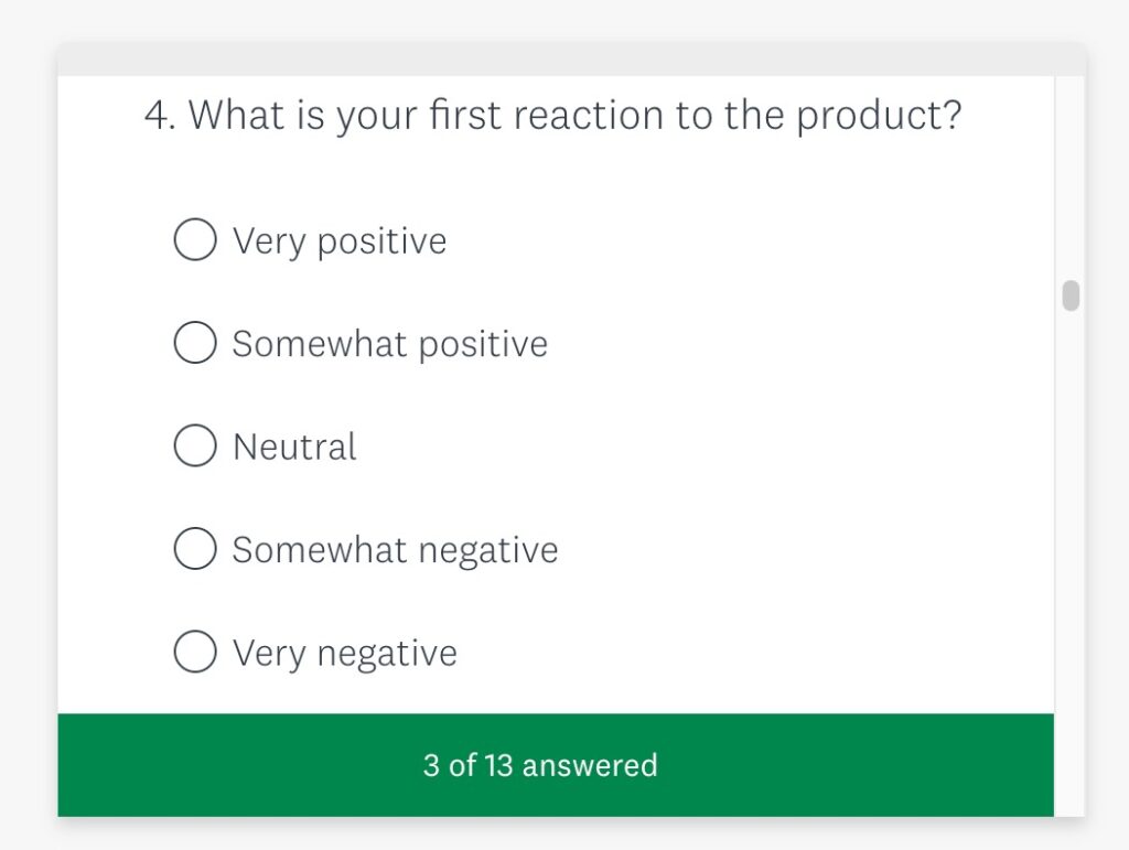
A visitor survey could be designed to get your visitors thinking about their needs and desires for your sort of business, for example. This could very profitably start people down the road of exploration of your services and could easily lead them to become your eventual customers.
However, if your visitors are coming to your site on assistive devices, like screen readers, and for some reason your survey relies on nonstandard HTML, you might have trouble. If the custom widget you’re using blocks the ability of some of your visitors to add their opinions, this frustration may have the very opposite effect to the one you’re hoping for. Your visitors may leave your site prematurely, and might, in fact, share their poor experience with all their friends and family.
The simplest way to check your interactive elements is by trying to navigate them using your keyboard only. Although technically this only simulates the experience of keyboard-only visitors, it gets close to also telling you if what you have works for screen reader users as well.
To perform this check, simply reload the site and on the fresh load, start hitting the Tab key repeatedly to move through your site. Once you’ve made it to the interactive element, make sure the pertinent buttons are reachable by tabbing, and that you can tab to any fields you need your visitors to fill.
Animation
The last multimedia addition to your site that I‘d like to tackle is animation. By “animation”, I’m not talking about individual artifacts that you add to your site to make a point. Instead, I’m talking about those delightful little things some website owners treat their visitors to that add interest and surprise.
I’m talking about such things as that cute little butterfly that follows your mouse pointer around the screen, or the way buttons turn into spinning, swirling disks when you click on them. Or I’m talking about how the text and images swoop in from the left or right as you scroll down the page. Or how about the ubiquitous parallax on images, where the view of the image itself scrolls subtly up or down when you scroll the page? These add dimension and delight to websites, right?
Well, yes, they can be delightful and make your site memorable, however they can also be overdone, or done wrong. If done wrong, animation on your site could be distracting, distressing, or even debilitating, so you do need to take care with how you use these elements that you probably only intend to be fun and engaging.
Distracting
Visitors to your site who have Attention Deficit Hyperactivity Disorder may be delighted by your animations all right. Unfortunately, they may be so delighted by them that they become completely unable to focus on the point of your site. As the Verge’s S.E. Smith points out, for some visitors, the animation becomes all they can think about.
If the point of your website is engagement, and one practice can simultaneously grow engagement for some people and utterly shut it down for others, your responsibility is to balance things. At the end of this section we’ll discuss how to balance your use of animation effects.
Distressing
Visitors to your site who have certain vestibular disorders may be significantly distressed by the use of the previously mentioned parallax images. When the image itself is scrolled and revealed at a rate different from the rest of the page it’s on, this creates for some people an equivalent sensation to how many of us experience motion sickness when reading or looking at something inside the car that isn’t moving in the same way our bodies would expect it to, given the sensations it’s experiencing. If you're not likely to be negatively affected, you can start the following video to see an example of parallax.
For most people affected by this, the reaction caused by the parallax content may be uncomfortable, though relatively slight. Even for those people, you should make a plan to lessen the chance of that discomfort. For other people, parallax images could trigger severe reactions including vertigo, dizziness, or even vestibular migraines. Because of this, it’s essential that when including animation effects like this that you have a plan to mitigate the potential problems introduced by it.
Debilitating
At the most severe side of things, some animation effects can debilitate people who have certain conditions. Back in 1997, intense flashing in an episode of Pokemon triggered some six- or seven-hundred cases of epileptic seizure, triggering a few days of mass hysteria in Japan.
The mass hysteria that followed the incidents of seizure shouldn’t denigrate the impact of the problem of the flashing content, which is why according to the WCAG, no content on a website should flash more than three times per second, but my standard is to get rid of any flashing content entirely. Better safe than sorry.
Respect User Preference
Flashing content aside, though, other forms of animation in websites are okay, or can indeed beneficially increase engagement if the problems they cause some people are planned for and managed, so that’s what you should do. Fortunately, the solutions are fairly simple to understand and not very difficult to implement, in most situations.
The key to getting it all right with your animations is to simply make sure that your site is set up to respect your users’ preferences. Yes, you might say, you’re willing to do that of course, but with a thousand visitors a day, how can you possibly even find out all of their preferences? And then how can you balance the preferences of those who are devastated by the animations with the ones of those who love the animations? It makes it awfully difficult to apply a single standard to your site with preferences all over the place, as they are…
This is true until you learn of one particular media query in CSS that is going to be your best friend. Most commonly, media queries are used to define page layouts depending on the browser width, so a desktop’s three-column grid might become a single column in mobile to better fit that device’s screen. Less commonly known, but supremely useful in the context of our discussion today, is the query “prefers-reduced-motion”.
This setting is updated in the desktop settings of the computer the visitor is using, which means the setting follows the user around to all sites they visit. This has the advantage of allowing the user’s preferences to be changed once at the computer level, and it'll take care of them wherever they go, provided each site is set up to respect it.
On the website side of things, this is a CSS rule that you can set up either sitewide, or on the particular page that has the animation, and takes this form:
            @media (prefers-reduced-motion) {
               styles used to negate any animation on the page/site go here
            }
If this query is included in the site-wide styles, then it only has to be declared once, and every time more animation is added to the site, you could just come here to undo the styles used to animate the elements.
For animations effected by javascript, you won’t be able to write a simple CSS rule to get them to obey the reduced-motion preference, so you’ll need to write some javascript to do it. That’s a little bit beyond the scope of this post, but you can find the instructions for using JS to respect motion preferences at since1979.dev.
The writing on the wall
We've certainly come a long way since neolithic times when shadow puppets were our only option for multimedia. We've come far enough, though, to realize that the delight multimedia brings, and the impact it has, must be for all people, even if some access it differently. Making your video and multimedia work for all visitors is essential, and isn't really that difficult a process. Furthermore, going through the process will probably help all your visitors enjoy your media more. Even if it weren’t required, it would definitely be worth it!