
Carousel sliders are still popular despite years of lackluster effectiveness. It’s best to eliminate them entirely from your site. We’ll tell you what to replace them with, and if absolutely necessary how to make sure they do the least amount of damage possible.
Why carousels seem appealing
Remember those summer days of your childhood when to escape the oppressive heat you persuaded your folks to set up the Slip and Slide? Remember the exhilaration of running full speed down the lawn and then diving, superman-style into the air, landing on your belly on the cool wet plastic sheeting, and slipping down the twenty feet of the slide and sometimes right onto the grass at the end? That sense of giddy abandon was intoxicating!
Twenty years later when you started seeing carousel sliders on web pages, you might have felt much the same giddiness. Now you were in charge of the advertising for your company, and you’d been told many times that you need to get your most important information above the fold of your website, and a slider was a way to do that. Now you could put three, four, five different offers right at the top of your site instead of just having one block with one bit of information. Brilliant, right? Unfortunately not.
I mean, you can do it, and it does ostensibly accomplish your goals: you can fill a slider with beautiful images, important information, and alluring offers. But your actual goal is to get that information to your audience, and unfortunately, this is what sliders are absolutely abysmal at accomplishing.
Carousel sliders are ineffective

Study after study has indicated that real visitors hate carousel sliders. The Norman/Nielsen Group, a firm specializing in usability studies, summed up several years of research back in 2013 by stating, “people often immediately scroll past [sliders with large images] and miss all of the content within them”.
Carousel sliders were only a few years old at that point, and were likely still riding on the laurels of their fairly new wow factor, but even at that point they had stopped being very effective, and it’s only gotten worse over the years. They look and feel like ads, so people usually avoid looking at them.
Furthermore, even if someone does deign to look at the slider, half, two-thirds, three-quarters, or more of its content is hidden to begin with. If the slider is set up to autorotate, which brings with it its own set of challenges, those subsequent slides may become visible at some point, but unless the visitor is just sitting there waiting with bated breath for the next slide, it’s not likely that they’ll see any of those other slides even if they do look at the first.
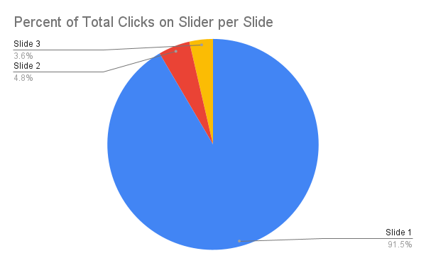
The research bears this supposition out. A number of years ago, Erik Runyon, the Technical Director and developer for Marketing Communications at the University of Notre Dame did research showing that when the few clicks a slider may receive are attributed to which slide received it, the first slide took 50, 70, or even 90% of clicks. That’s a precipitous dropoff indicating that the large majority of the people who do look at the slider only look at the first slide.
This is why I like to say that if there’s something you’d really like to hide from your visitors (like maybe that shot of you going down the Slip and Slide at the retro company party last summer), you should probably put it in a slider.
Carousel sliders are often inaccessible
Hopefully all of this has persuaded you to ditch the slider on your website, but just in case you’re still slipping back and forth between deciding for and against your slider, let me add some insult to injury, or rather as the prosecuting sharks would tell you, some injury to insult: carousel sliders are more often than not wildly inaccessible.
In the best case scenario, visitors to your site who need to use assistive technologies like screen readers, braille displays, or even simply keyboards for navigation, may not be able to access what’s in your slider. This may not actually result in a different outcome than for the scores of visitors who simply choose to ignore your slider, but it still counts as discrimination. If for some bizarre reason visitors on assistive devices wanted to go through your slider, I’d say in the majority of cases they’d be unable to make it very far.
Faulty or Missing Controls
Often the controls are not labeled, so visitors won’t know how to get around it. Sometimes there are no controls at all meaning there’s either no way to get through the slider, or that they’ll need to move through each element and each slide of the slider individually in order to get past it. After doing this, there’s probably not be any indication when they’ve finally accomplished that feat.


Erroneous Aria
Assuming the slider is actually navigable by people on assistive devices, let’s dig into the weeds a little more. It’s fairly common for slides that are not currently visible to have an erroneous aria attribute of “hidden”, even when these slides contain actionable items like links. All of the slides, whether visually hidden or not, are part of the page, and screen readers have special ways to let their users move around the page to compensate for the fact that they can’t just glance around it like sighted users can.
Anything with the aria-hidden attribute, though, is completely hidden from assistive technology users, even if it may have an important action item. I’ve seen carousel sliders that present a company’s various critical services, along with links to more information about them. If all but one of these is hidden the moment screen-reader users have their screen readers call up what’s on the page, they’ll get an incomplete list.
Sticking anything you want your visitors to know about in a slider is a terrible idea, as we’ve discussed. But if the slider makes that information actually invisible to assistive technologies and their users, it becomes a serious problem and can even be considered discriminatory.
Autorotate
Another feature of carousel sliders that often hurts the accessibility of the site is when they automatically advance. Since you’re hiding information in the slider, you of course want this to be revealed at some point, but the mechanism of autorotation can be really detrimental and distracting to some people with cognitive disabilities.
People with ADHD may have their thought processes completely derailed by either the new information that has just slid in, or even by the mere mechanism and movement itself. That’s why, to be compliant with the WCAG, auto-rotating sliders would need an easy-to-find mechanism to disable the movement. Many carousel sliders, though, are missing this basic functionality.
Furthermore, people who are slower readers, or slower, more deliberate thinkers, may need more time than the auto-advancing slider gives them to read the information in the slide. Heck, even I, who read sometimes at 600 words per minute, often find it difficult to absorb everything on some of the carousel sliders that are set to advance too quickly.
Alternatives to carousel sliders
So now that you’ve decided to ditch the slider on your site, you’re probably left wondering what you should replace it with. Let’s consider some options.
Replace the slider with… nothing
After crumpling up the blinding yellow sheeting of the Slip and Slide, your lawn looks awfully barren, doesn’t it? Not really. It looks like a lawn, and like it’s ready to do what lawns do best. By a similar token, you may not need to replace your slider with anything at all.
Servertastic did an A/B comparison with their own site to see how removing their slider affected their conversions, and found that over the course of a year, the versions of their site with the slider simply removed resulted in an average of 16.5% greater revenue per visitor.
This wasn’t a very broad study, but at least it did run for quite a while, and involved many views of the site by a viewing base as diverse as Servertastic’s is. Everyone wanting a website needs hosting, so presumably their audience comes from all sectors. A greater than 16% increased conversion is pretty compelling.
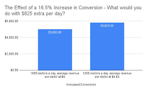
One thousand visitors per day with an average revenue per visitor of $5 would lead to an extra $825 per day just by removing the slider. What would you do with the extra $825 per day?
Replace the slider with a single static image
Since your slider is in that coveted above-the-fold position, you may decide you can’t simply take it off—its real estate is too valuable. In this case you may want to replace it with a single hero image that’s the equivalent of whichever of the slides you find the most powerful and important (probably the first).
To technically achieve this, you could simply remove all the other slides from the carousel and leave just the one. You might do better, though, to actually recreate the slide in a separate static section and ditch the slider architecture entirely.
You’d think that a slider with just a single slide would be the same as a simple hero section. I’ve found, though, that carousel sliders with just one slide often harbor unexpected oddities of code. In this case, it’s still the scaffolding for all the old and unused slider functionality, and lots of times that scaffolding is problematic.
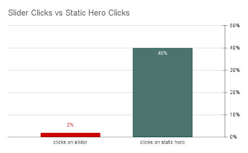
In any event, though, Mårten Angner, a UX designer from Sweden, found out through some A/B testing on his company’s site, that when there was a slider at the top of the page, it garnered only 2% of all visitor clicks, whereas when he converted it to a hero image, it took in 40% of all visitor clicks. This shows that visitors are much more willing to engage with a hero than with a slider, which is really no surprise.
Replace the slider with static image blocks
If you are really in love with all the information you put in the various slides of your slider, and still want all that to be visible above the fold, or as close to it as possible, you may decide that it makes sense to sort of recreate the slides in miniature, in a static three-column grid, or even a four-column grid.

To maximize the impact of your images and info, I’d say a two- or three-column grid will be better than four-, even if this means you need to wrap your grid down into two rows rather than one. In any event, this sort of static section would be essentially an extension of the Angner method, and should lead to similar results.
If you’re mourning the fact that carousel sliders’ cool factor wore off a dozen years ago, you might consider giving your image-offers a lightbox effect that would expand each to fill the screen on click, and then contract it on the next click. This would technically turn those image-offers into popups, but they’d be visitor-initiated ones, and so wouldn’t invite visitors’ ire the way automatic popups do.

This expanding-image-offer idea is similar to what Dr. William Sen of BlueMedia Marketing recommends for image galleries, instead of putting them in carousel sliders. Some designers say displaying beautiful images of products, brand artwork, etc, is a compelling use of carousel sliders.
This might have been compelling in years gone by, says Dr. Sen, but it isn’t so much today. Instead, he contends you should include galleries as sections full of thumbnail images that trigger lightbox popups when you click them.
If only a slider will do
At the end of the day, you may have no choice. The website owner wants a slider in there, and can’t be talked out of it. How do you make sure the slider you put in there will do as little damage as possible?
Don’t have it advance automatically
This will make it seem most like a static image and will lead to greater interactions and conversions. If it must slide automatically, make sure there is some fairly obvious way for visitors to disable this motion. That way it’ll at least be compliant. Also be sure to set the timer on the advance function high enough that people can comfortably read and take in the entire slide before it moves to the next. To figure out how long this should be, follow these steps:
- Start a stopwatch.
- Take a deep breath.
- Look up at your screen and leisurely read the information on your longest slide.
- Take a beat to look at the image and reflect on it for a moment.
- Move your mouse up into the slider and position it within the call-to-action button.
- Stop your stopwatch.
If you follow those steps, it’s unlikely that you’ll set the slides to advance too quickly.
Assume that the slider will be entirely skipped by your visitors.
This is to say that if there are important things in your slider, you should go to great lengths to make sure that the slider isn’t the only place in the site where that information is presented. The slider should not even be the only place on that page where the information is presented. Duplicate the information!
Give keyboard and screen-reader users a way to skip over the slider
Rather than forcing your visitors to tab ten or twelve, or even just five times to get past your slides as they undoubtedly want to, give them a skip-section link similar to the link that lets them skip your menu at the top of the page.
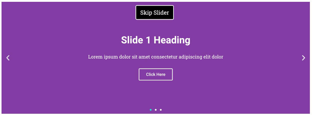
They’re wanting to skip past your slider like everyone else can. If you give them this ability, they may be less annoyed and stay on your site longer rather than being frustrated and bouncing away from your site.
Rolling It All Up
In today’s internet landscape, there’s really no place for carousel sliders. They may have served a purpose and been effective twenty years ago when they first arrived on the scene, but they’ve long since lost the ability to serve any useful purpose on your website, and replacing them with nearly any other element at your disposal (or with nothing!) is likely to lead to better conversion rates, and a more effective site.
It’s time to roll up the Slip and Slide, stick it at the bottom of your games closet, and never pull it out again. If you’re compelled to use a slider on your website, though, make sure that it only autoadvances if there’s a mechanism to stop it, and at a rate that each slide can be easily digested by your visitors, even the ones who read or think more slowly than you.
Make sure your slider has controls that can be used easily by people navigating by keyboard (and hence likely by people navigating with assistive devices). Make sure it doesn’t use any erroneous aria, and consider pleasing your visitors by giving them an easy way to skip over it.